
Data Visualization Course
August 11, 2026 2026-08-12 8:41Data Visualization Course
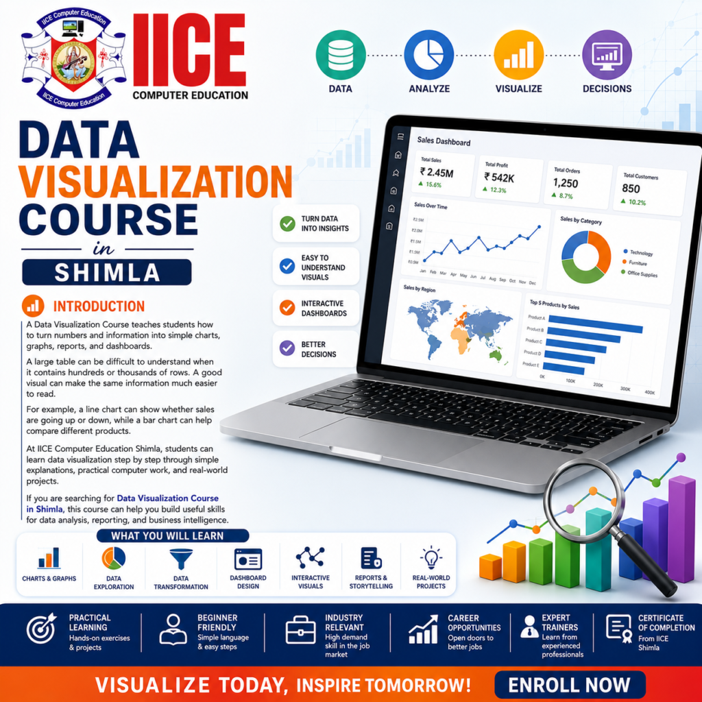
Data Visualization Course in Shimla
Introduction
A Data Visualization Course teaches students how to turn numbers and information into simple charts, graphs, reports, and dashboards. A large table can be difficult to understand when it contains hundreds or thousands of rows. A good visual can make the same information much easier to read. For example, a line chart can show whether sales are going up or down, while a bar chart can help compare different products. At IICE Computer Education Shimla, students can learn data visualization step by step through simple explanations, practical computer work, and real-world projects. If you are searching for a Data Visualization Course in Shimla, this course can help you build useful skills for data analysis, reporting, and business intelligence.
What Is Data Visualization?
Data visualization means showing information through visual elements such as charts, graphs, maps, tables, and dashboards. Instead of reading a long list of numbers, people can look at a well-designed visual and understand the main message more quickly.
For example, imagine a school has the marks of 500 students. A long table may be difficult to understand, but a chart can show the average marks of each class and make comparisons much easier.
A Data Visualization Course helps students understand how to choose the right visual, organize information, use charts correctly, and explain what the data is showing.
Why Learn Data Visualization?
Businesses collect a lot of information about sales, customers, products, employees, marketing, expenses, and performance. However, simply collecting data is not enough. People need to understand that information before they can use it to make decisions.
Learning data visualization helps students present information in a clear and useful way. A good dashboard can help a business quickly see its sales, customer growth, expenses, or performance.
A Data Visualization Course in Shimla can therefore be useful for students, graduates, job seekers, working professionals, and beginners who want to build skills in data analysis and reporting.
Data Visualization Course – Syllabus
Module 1: Data Visualization Fundamentals & Excel
- Introduction to Data Visualization
- Importance of Data Visualization
- Types of Data
- Understanding Data Tables
- Choosing the Right Chart
- Bar and Column Charts
- Line Charts
- Pie Charts
- Area Charts
- Scatter Charts
- Excel Charts
- Excel Tables
- Sorting and Filtering
- Basic Excel Dashboards
- Data Visualization Best Practices
Module 2: Advanced Charts & Data Storytelling
- Advanced Chart Creation
- Combo Charts
- Histogram
- Box Plot Basics
- Heat Maps
- Treemaps
- Waterfall Charts
- Funnel Charts
- KPI Visuals
- Conditional Formatting
- Trend Analysis
- Comparative Analysis
- Data Storytelling
- Visual Hierarchy
- Effective Chart Selection
Module 3: Power BI for Data Visualization
- Introduction to Power BI
- Connecting Data
- Data Cleaning
- Power Query
- Data Modelling
- Data Relationships
- Charts and Visuals
- Cards and KPIs
- Filters and Slicers
- Interactive Charts
- Drill-Down
- Dashboard Design
- Interactive Reports
- Power BI Dashboards
Module 4: Tableau, Dashboards & Practical Projects
- Introduction to Tableau
- Tableau Interface
- Connecting Data
- Tableau Charts
- Filters and Parameters
- Interactive Visualizations
- Tableau Dashboards
- Dashboard Layout
- Data Storytelling
- Business Intelligence Reports
- Sales Dashboard Project
- Customer Analysis Project
- Marketing Dashboard Project
- Business Performance Dashboard
- Final Data Visualization Project
Why Choose IICE Computer Education Shimla?
Choosing the right institute is important when learning a practical skill like data visualization. IICE Computer Education Shimla focuses on computer and technology education and can provide students with a structured learning environment where they can understand concepts, practise on computers, and work on practical assignments.
Key Reasons to Choose IICE
- Practical Learning: Students can learn by working with data, charts, reports, and dashboards instead of only studying theory.
- Beginner-Friendly Teaching: Complex topics can be explained in simple language so that students can understand each concept step by step.
- Multiple Tools: Students can learn important visualization tools such as Excel, Power BI, and Tableau as part of their wider data skills.
- Project-Based Practice: Practical projects can help students understand how visualization is used for sales, customers, marketing, business performance, and other types of data.
- Career-Focused Skills: The training can help students develop useful skills for data analysis, reporting, business intelligence, and visualization-related career paths.
- Trainer Guidance: Students can ask questions during learning and receive guidance while practising different tools and creating reports.
- Local Learning in Shimla: Students who prefer classroom learning can study locally in Shimla and practise their skills in a structured learning environment.
- Step-by-Step Learning: The course can take students from basic charts and data concepts toward interactive dashboards and practical projects.
FAQs
What is a Data Visualization Course and what will students learn?
A Data Visualization Course teaches students how to turn numbers and information into clear charts, reports, and dashboards. Students can learn Excel, Power BI, Tableau, data storytelling, chart selection, dashboard design, and practical visualization skills.
Who can join a Data Visualization Course in Shimla without experience?
Students, graduates, job seekers, working professionals, and beginners can join the course without previous visualization experience. Basic computer knowledge is helpful, while the concepts can be taught step by step through simple examples and practical exercises.
Is data visualization easy for beginners to learn and understand?
Yes, beginners can learn data visualization when the concepts are explained using simple examples and practical exercises. Students can start with basic charts and gradually learn advanced visualizations, dashboards, filters, and interactive reports.
What topics are covered in Data Visualization training in Shimla?
The training can include chart selection, Excel visualization, advanced charts, data storytelling, Power BI, Tableau, dashboards, filters, KPIs, and interactive reports. Students can also work on practical projects using sales, customer, marketing, and business data.
Do I need coding knowledge before learning data visualization?
No, advanced coding knowledge is not required to start learning data visualization and create useful reports. Students can first learn charts, dashboards, filters, and visualization tools before exploring more technical data skills such as SQL or Python.
Can I learn data visualization after completing Advanced Excel training?
Yes, Advanced Excel provides a useful foundation for learning data visualization and creating reports. Knowledge of tables, formulas, Pivot Tables, charts, sorting, filtering, and basic dashboards can make it easier to learn Power BI and Tableau.
Which tools are taught in Data Visualization training in Shimla?
Students can learn popular tools used to create charts, reports, and interactive dashboards during the training. These can include Microsoft Excel, Power BI, Tableau, and other features used for data preparation, visualization, reporting, and dashboard creation.
What career opportunities are available after learning data visualization?
Data visualization skills can support different data, reporting, and business intelligence career paths. Depending on qualifications and experience, students can explore roles such as Data Analyst, Reporting Analyst, Data Visualization Analyst, BI Analyst, Tableau Developer, and Power BI Developer.
What practical projects can students create during visualization training?
Students can create practical projects such as sales dashboards, customer reports, marketing dashboards, expense reports, and business performance dashboards. These projects help learners practise charts, filters, KPIs, dashboard design, data storytelling, and interactive reporting.
Is data visualization useful for building a career in data analytics?
Yes, data visualization is an important part of data analytics because it helps people understand and present information clearly. Learning it with Excel, SQL, statistics, Python, Power BI, or Tableau can help students develop a stronger foundation for data-related careers.